MedRepublic
Medical tourism is the process in which a person that lives in one country goes to another country in order to receive medical, dental, and surgical care that might be equal or better in quality than their home country. The main selling point for medical tourism, however, is the affordability that is often associated with these types of medical visits outside of the person’s home country.
MedRepublic is a company that focuses on helping patients from the US and Canada find more affordable and better quality medical services outside of their country. My team and I were tasked with a website redesign with the goal of being more transparent to the users and simplifying the information architecture on the site with a deadline of two weeks.
Platforms Responsive Web
Role UX Designer
Year 2017
Process
My team and I worked together to figure out areas of the site that received the most traffic and usage. MedRepublic granted us access to their Google Analytics so we were able to delve deeper into their user traffic flow to get an understanding of how visitors were navigating the site.
Site flow
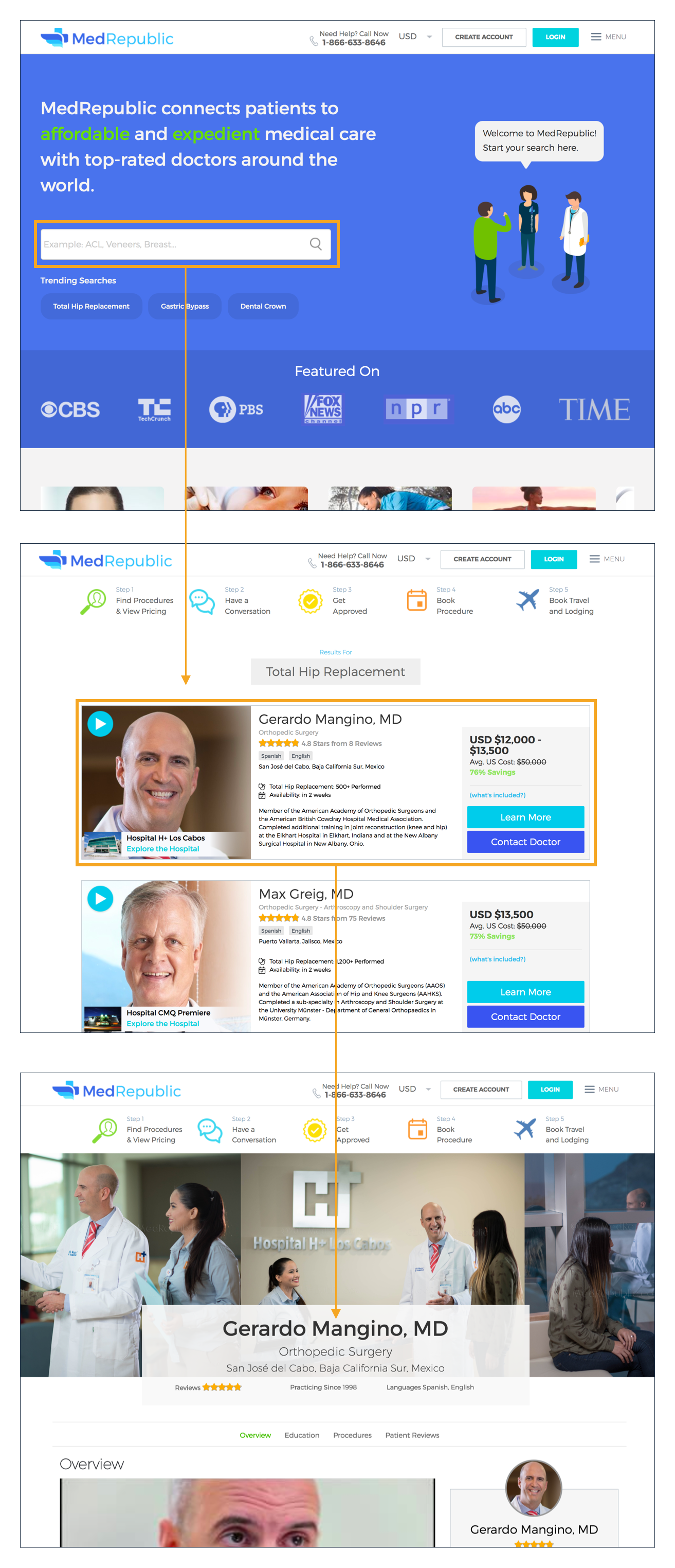
The pages that received the most traffic were the Home Page, Search Results, and Doctor Profile. After identifying those pages, we began to dive deeper into the UX of those pages to see where improvements could be made.

Home Page
For the Home Page, I focused the attention to the search bar and the 5 Steps to MedRepublic. The search bar was the main way users were going to access the rest of the MedRepublic site. As such, I wanted to make sure that the search bar was very prominent and drew the users attention. I also suggested placing more emphasis on popular searches that could help users get started quickly or give them an idea of what to search for.
The 5 Steps to MedRepublic served as a way to quickly educate users about the process of booking a doctor on MedRepublic. I wanted to make sure this information was readily available for users to the site so that they could quickly get an understanding of what MedRepublic was and how it would work. I suggested bringing the 5 Steps to sit below the search bar and above the fold of the page so that it had higher visibility for first-time visitors to the site.
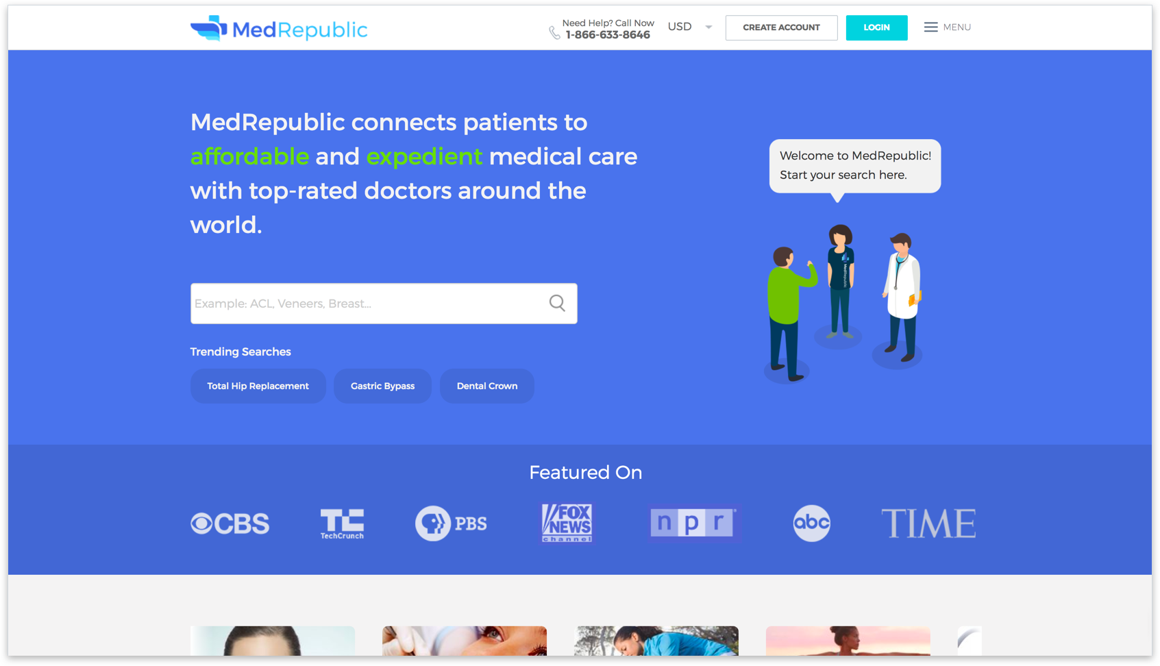
Home - Before
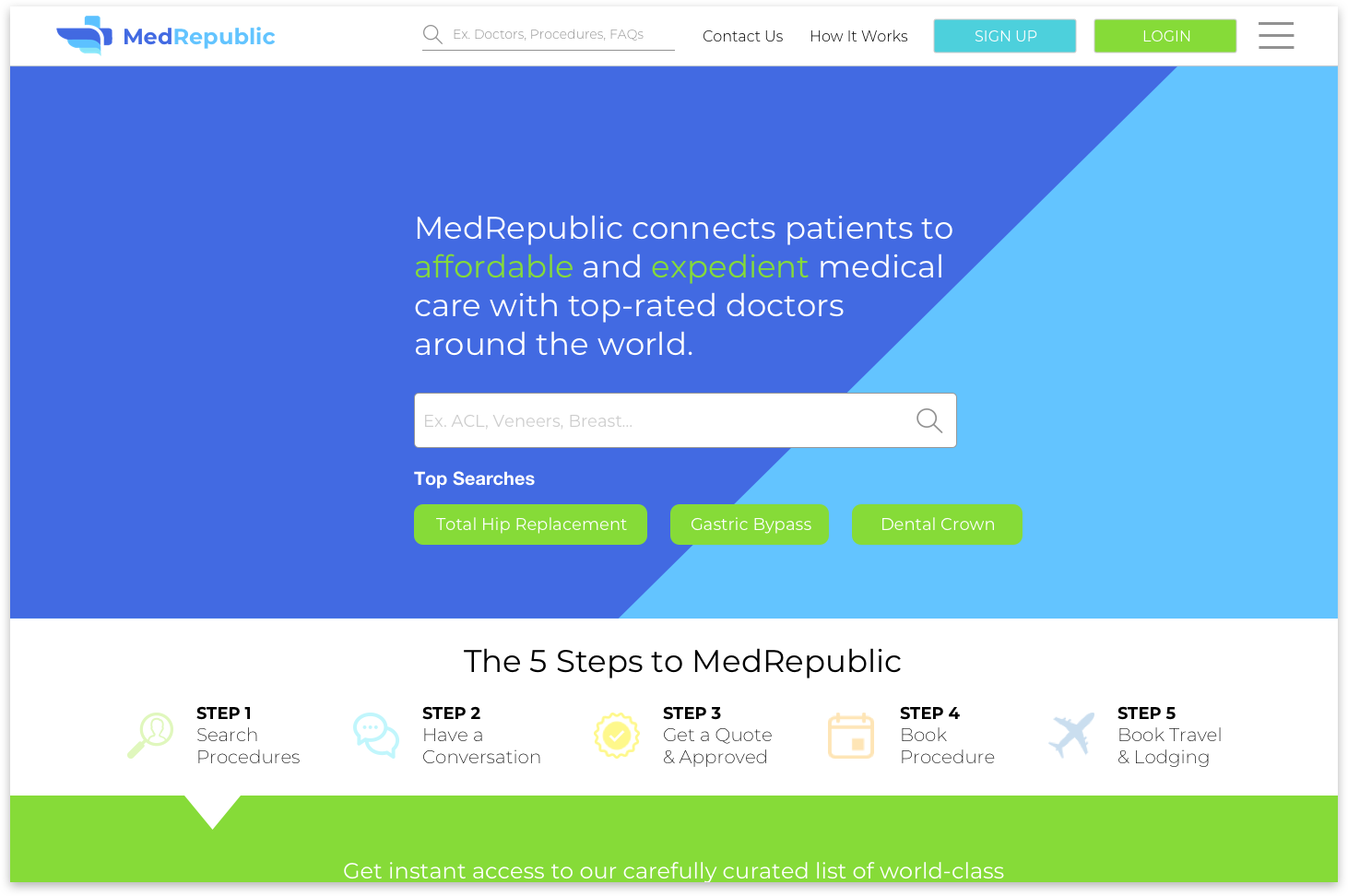
Home - After
Search
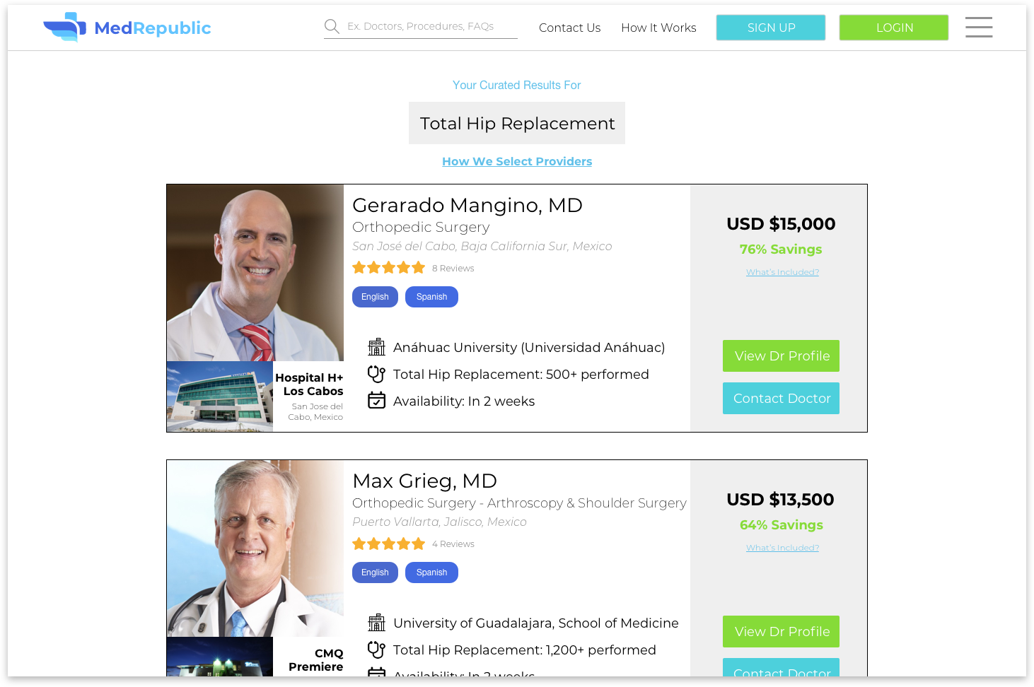
The Search Results page was made up of multiple cards that contained quick information about a doctor. My team and I ran user tests to figure out what users were looking for the most when booking a doctor online Through our tests, we were able to determine that a doctor’s education was the most important factor that user’s were looking for when browsing for a doctor online, followed by price savings and then doctor reviews. We took the results of the test and applied it to the hierarchy of the doctor cards on the page.
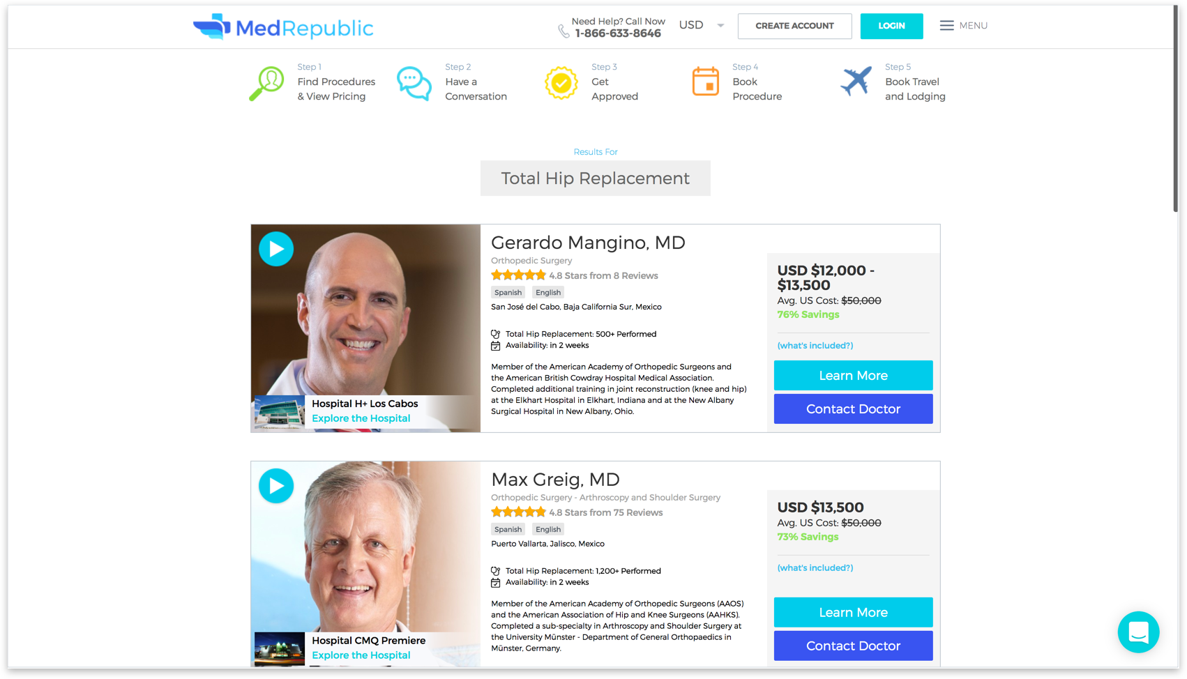
Search - Before
Search - After
Profile
The Doctor Profile pages had a lot of information and content that was provided to users. We ran another set of user tests that allowed us to determine the best way to group content together and cut down on the amount of navigating that a user had to do.
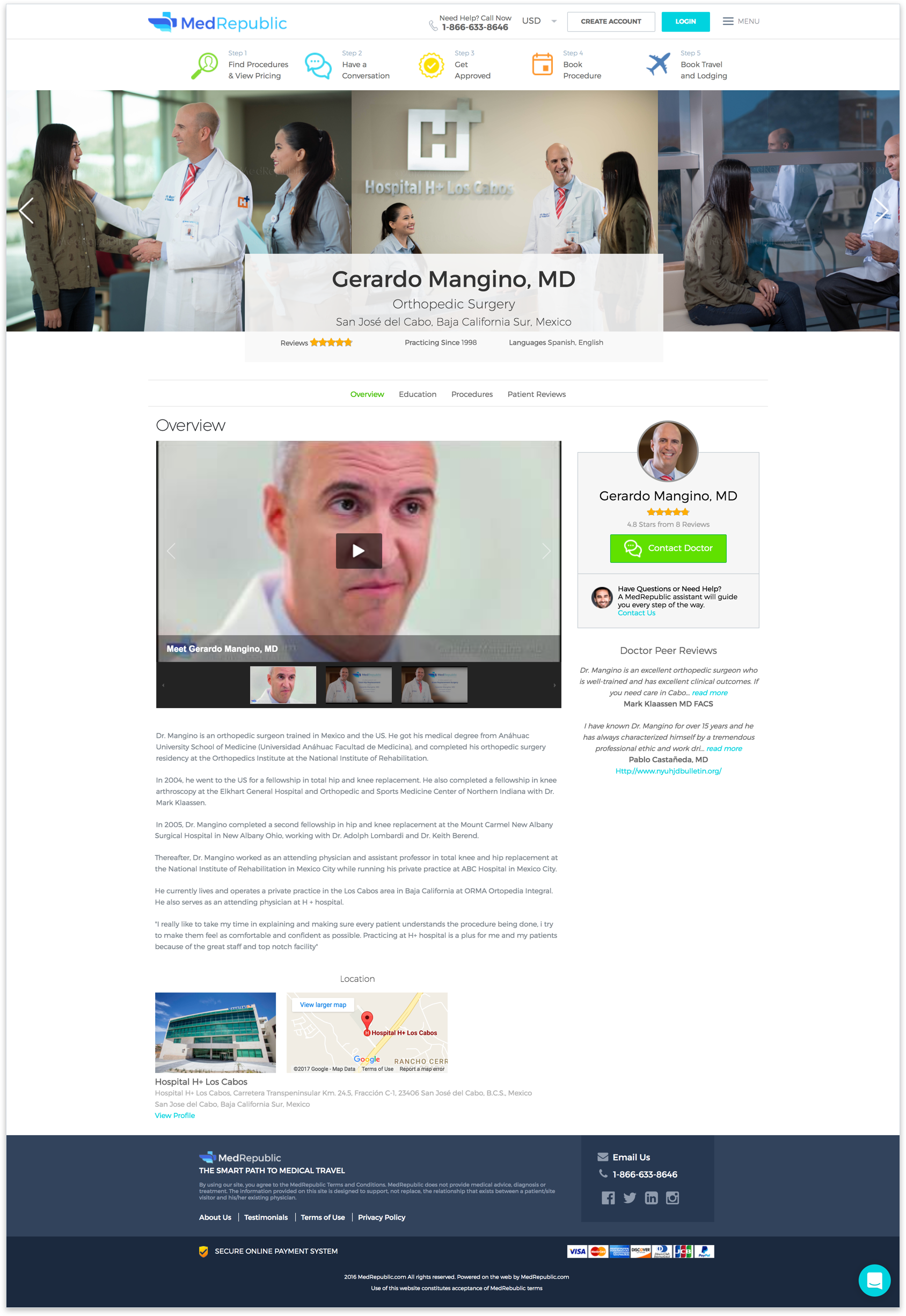
Profile - Before
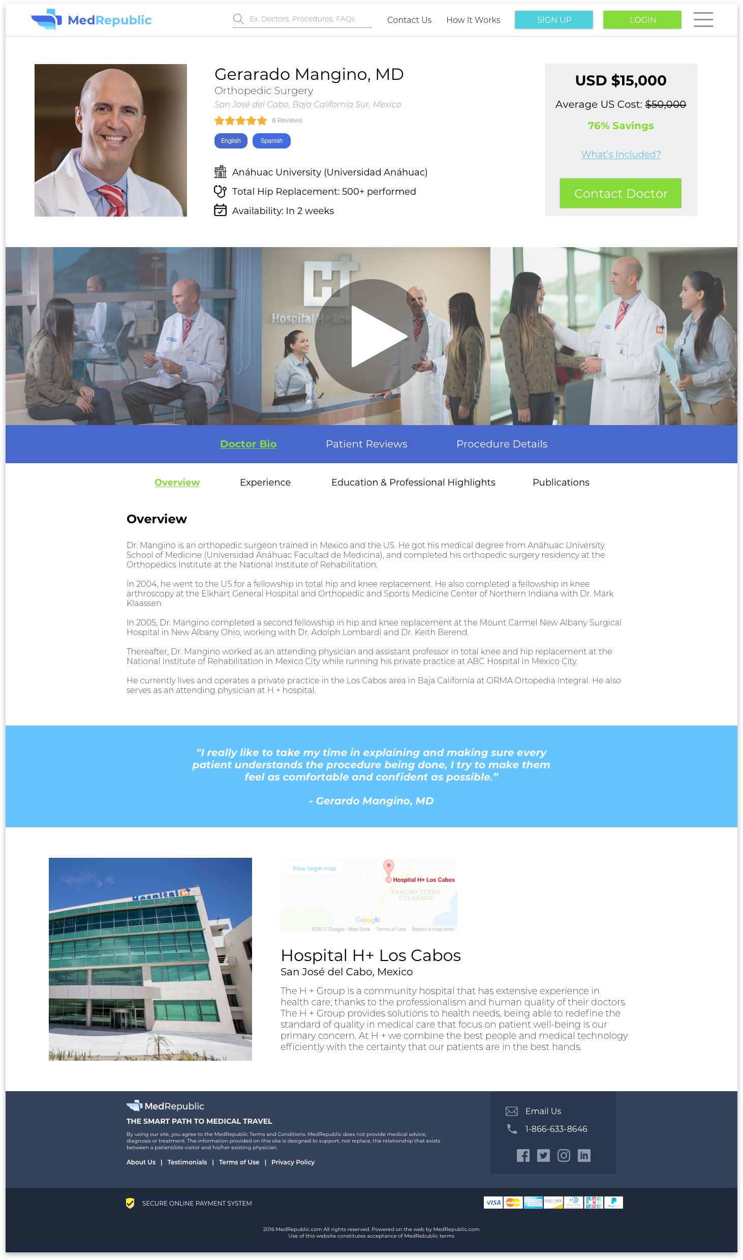
Profile - After
By grouping Doctor Bio, Patient Reviews, and Procedure Details together on one nav bar, this created less navigating via scrolling and presented all the doctor information in one place. In addition to grouping those three categories into one nav bar, we presented a sub-nav bar for categories that had additional sections of information.
Takeaway
MedRepublic offers an interesting business proposition to it’s users that are looking for more cost-effective and potentially life-saving procedures. By simplifying the page and providing users information more efficiently, we hope that would create more booked appointments and help users feel more confident about participating in medical tourism. If we had more time than two weeks, my team and I would have ran more user tests to further optimize the site for more conversions.
Thanks for dropping by. 
Thanks for dropping by.