What's next for Mobile Order?
After the successful launch of Mobile Order, my team was able to start tracking user data and feedback on the feature. Through the user data, our users pointed out that the Menu was the biggest pain point for them due to the lack of navigation and images. My team and I took that feedback and started on the next phase of Mobile Order which became the Menu Redesign.
My Role
I was in charge of all major UX deliverables such as user flows, concepts, final comps, and documentation. I created multiple prototypes throughout the project, including initial concepting prototypes, user testing prototypes, and motion studies for documentation. I also assisted with establishing a visual direction for the icon set that was used for each of the Menu categories.
Because this project allowed my team and I to travel to Orlando for user testing, I took this opportunity to further develop my relationship with my product and development teams, who were based in Orlando. Through this trip, we established a great relationship with both teams which paid off on this and subsequent projects. I worked with one Lead Designer and one Senior Designer during the duration of the redesign.
Discovery & Workshopping
Before my team and I started on any wireframes or concepts, I wanted to make sure that I completely understood all the business requirements for the project.
Based off what I heard from stakeholders and our Product/Engineering teams, I kicked off the project with this question to my team:
How might we make mobile ordering easier and more enjoyable for our guests?
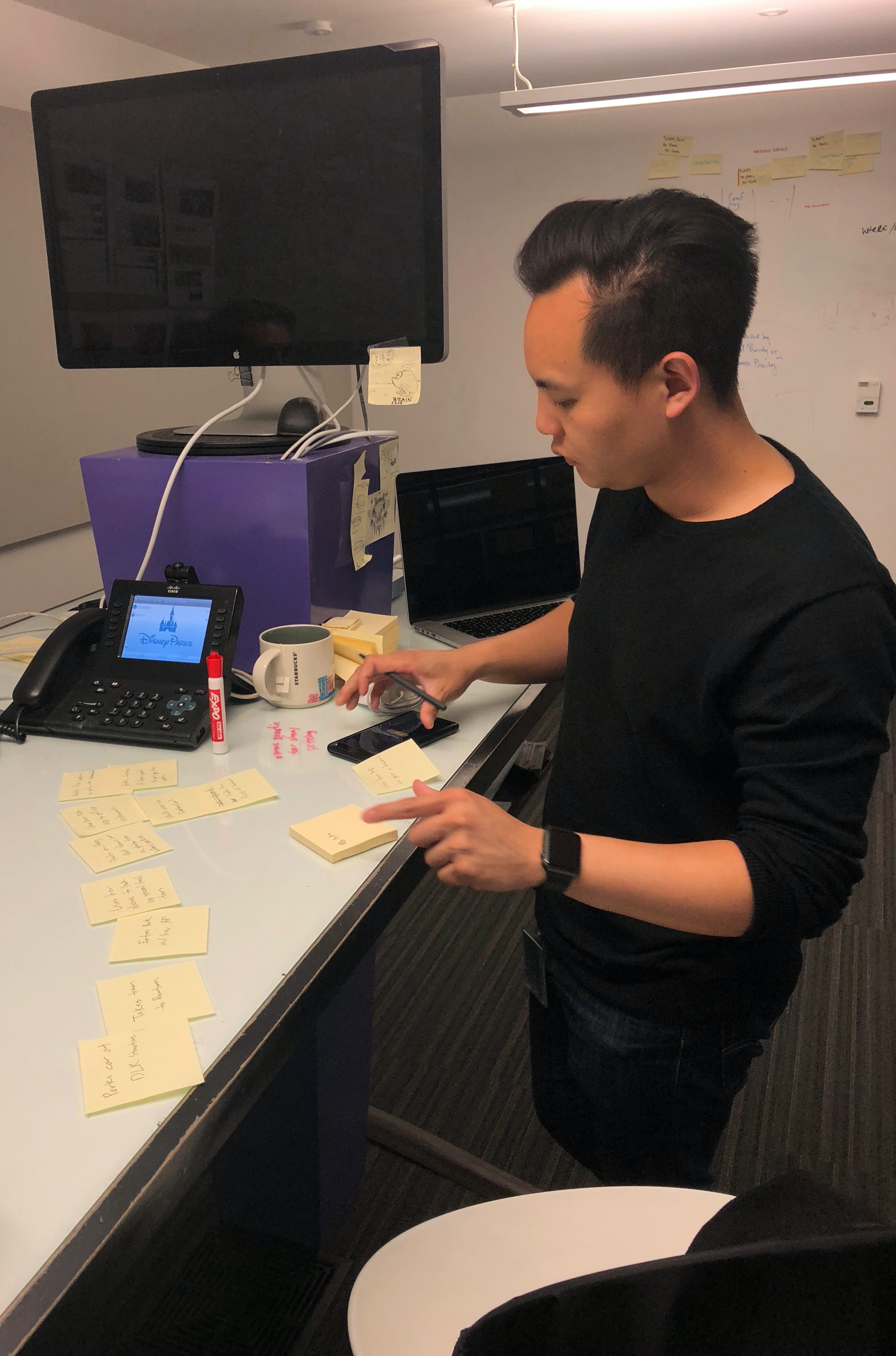
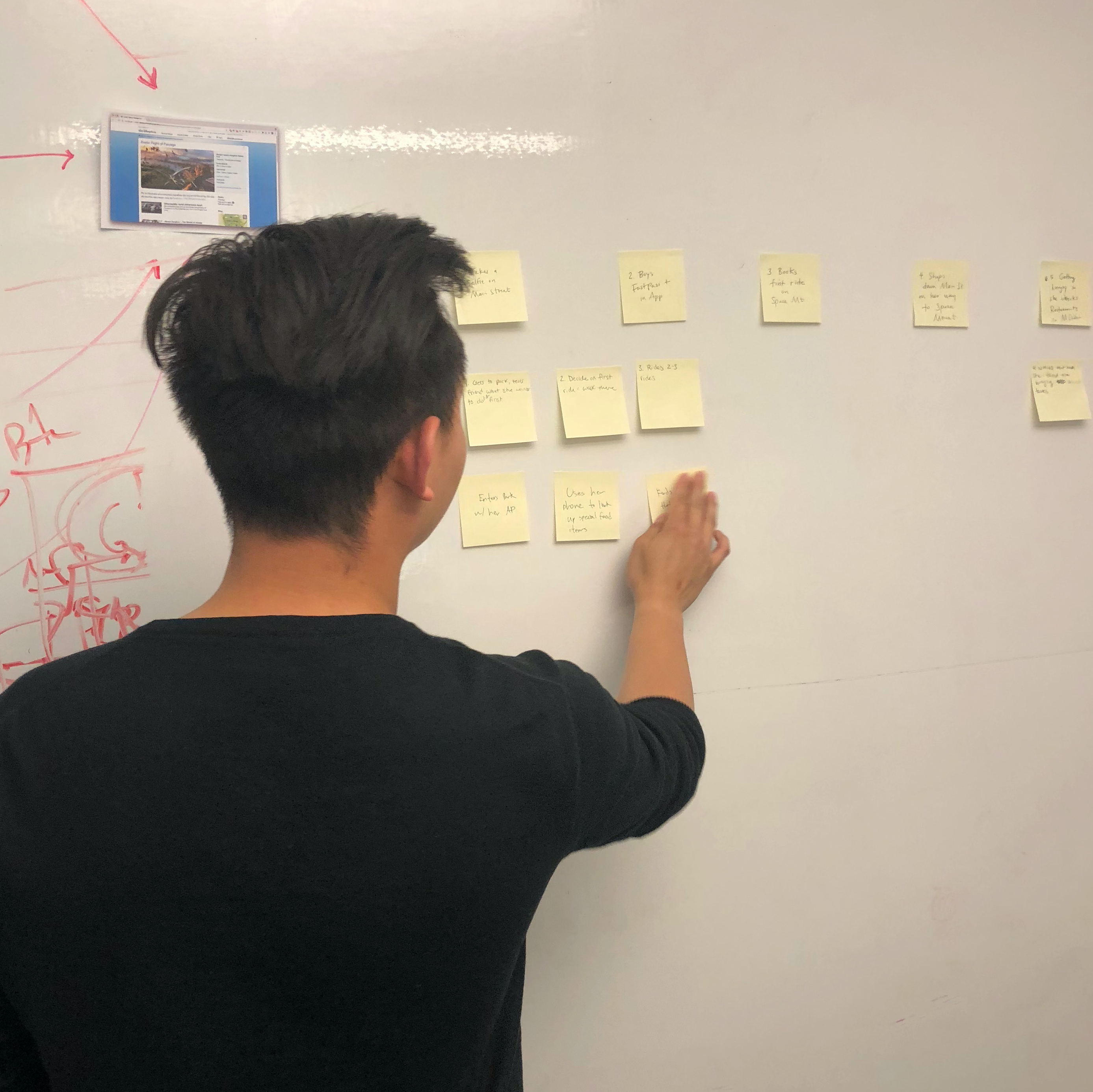
Asking this question lead my team and I into a workshop session where we did an audit of the exisiting Menu and started the initial brainstorming of solutions for making Mobile Order a much more enjoyable experience.

Finding the focus
At the conclusion of our workshop, we decided that we were going to focus on improving:
1. Navigation: Users should be able to easily browse between all menu items and variations across the Parks available restaurants.
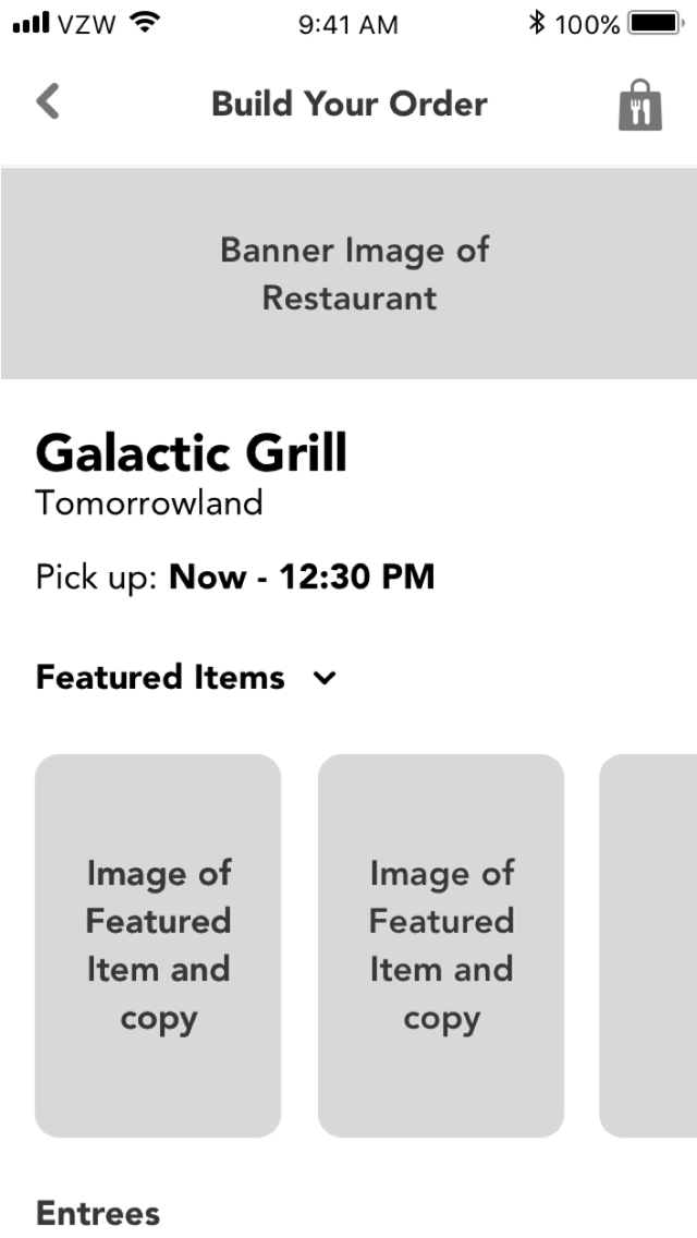
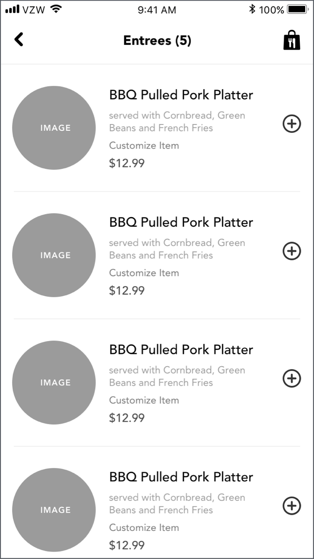
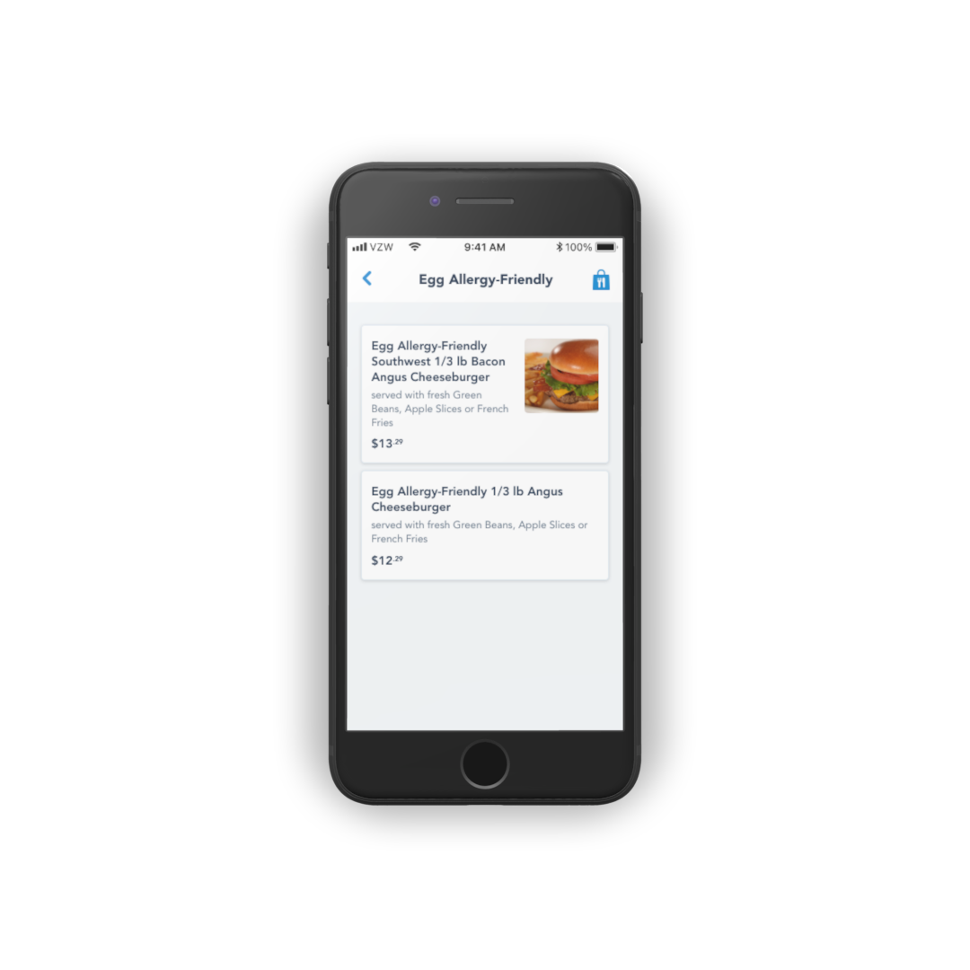
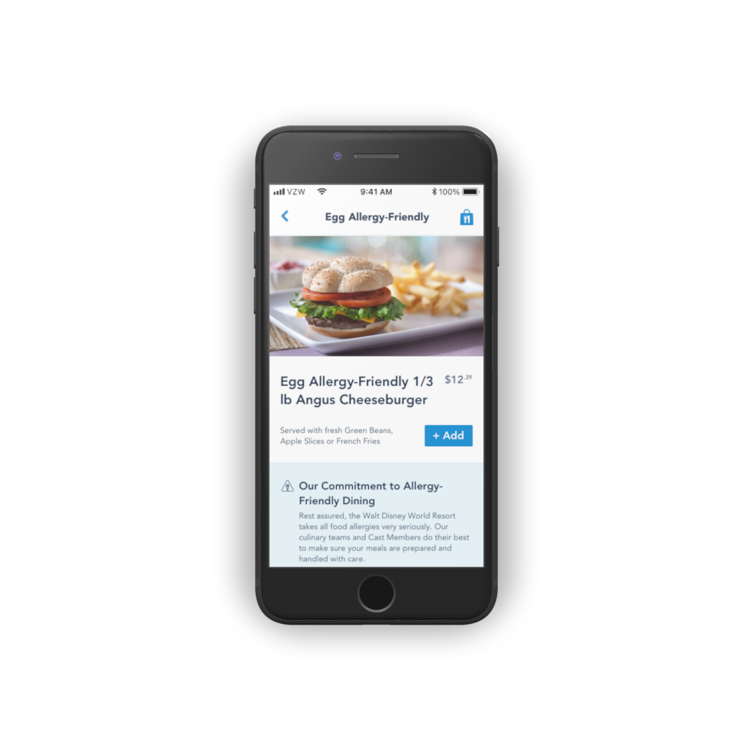
2. Visuals: The MVP launch of Mobile Order did not include pictures on the Menu. The only way to see an image of the food item was to tap into the Detail page for that particular item. Without pictures on the main Menu, it would be difficult for users to quickly browse for food, especially if they were on the move or in any other
3. Brand Identity: The Mobile Ordering experience should be fun and whimsical, just like the Disney brand itself. We wanted to bring as much of that "distinctly Disney" element into the product as possible.
Conceptualizing
After the workshop, I created a few concepts and wireframes to start discussions with design leadership and our product team. The goal of these concepts was to figure out which interaction patterns would work the best for our users.
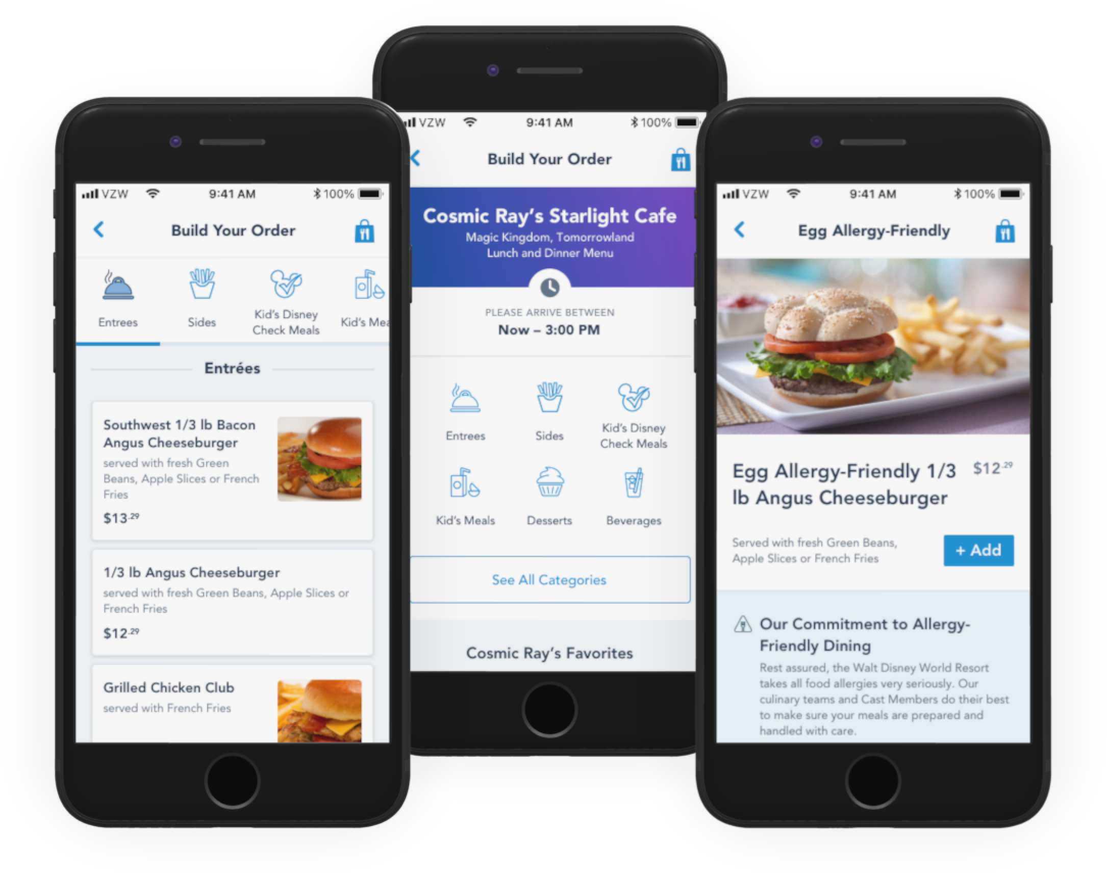
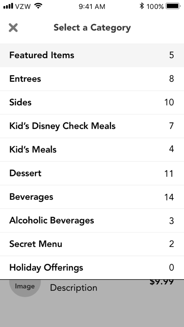
Dropdown
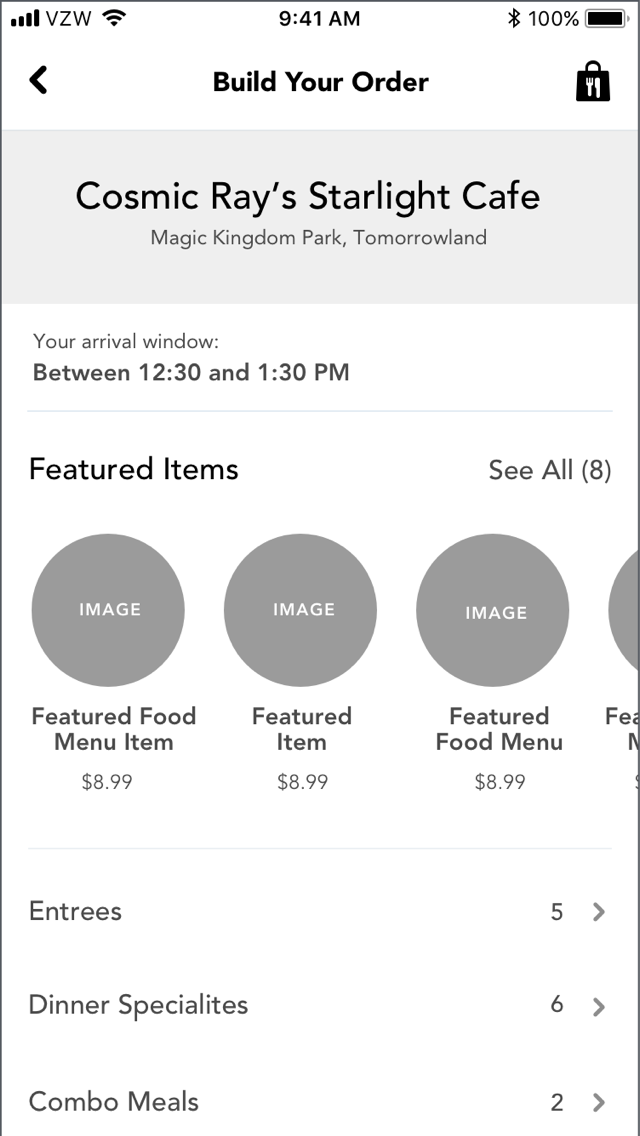
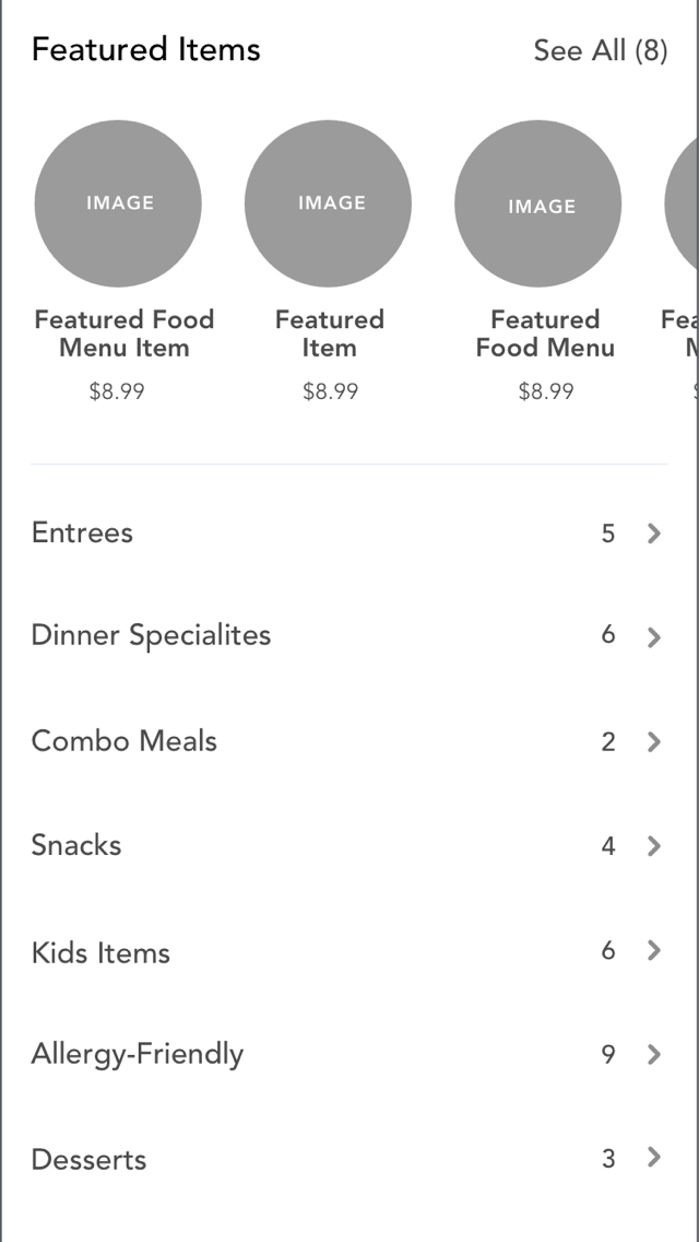
The menus for each participating Mobile Order restaurant could be a couple pages long. The Dropdown concept aimed to solve long scrolling by making each category a Dropdown menu that would allow for the user to easily jump between categories.
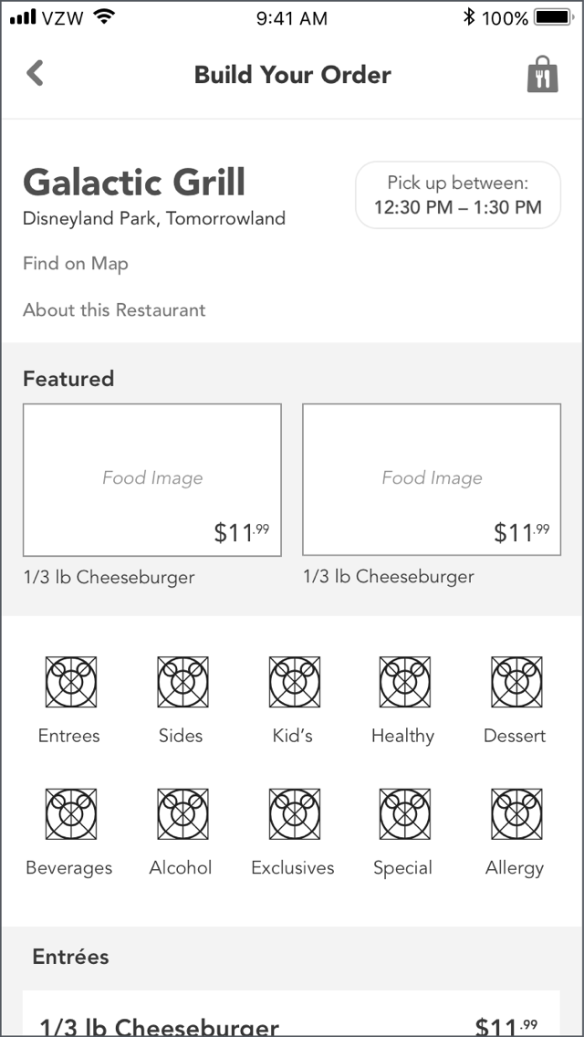
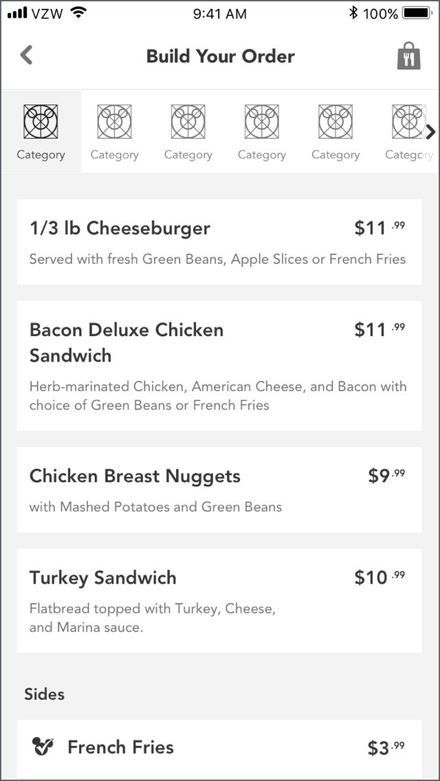
Carousel
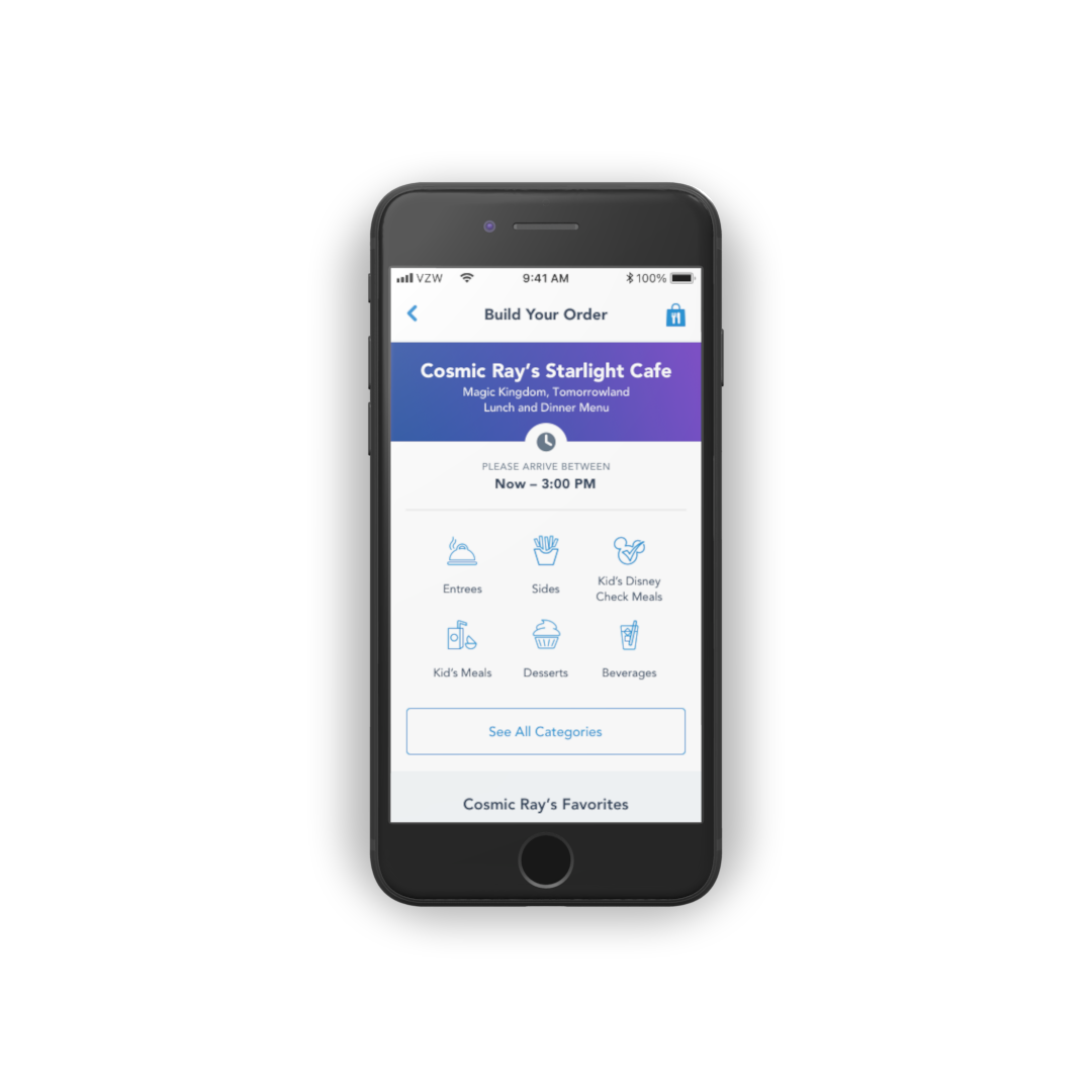
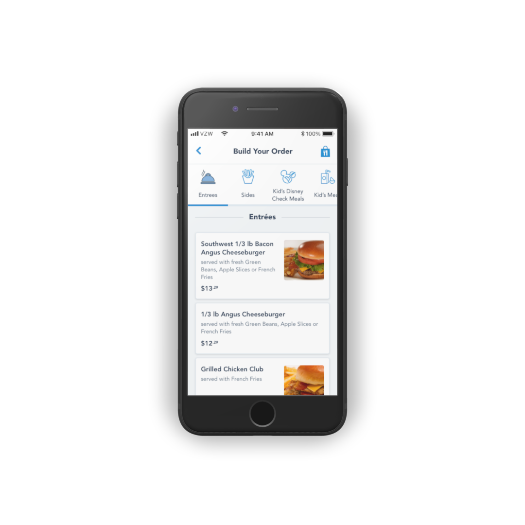
I took the category navigation idea presented in Dropdown a step further. By having the categories anchor to the top of the page as the user scrolled, this would ensure navigation was always present and easily accessible.
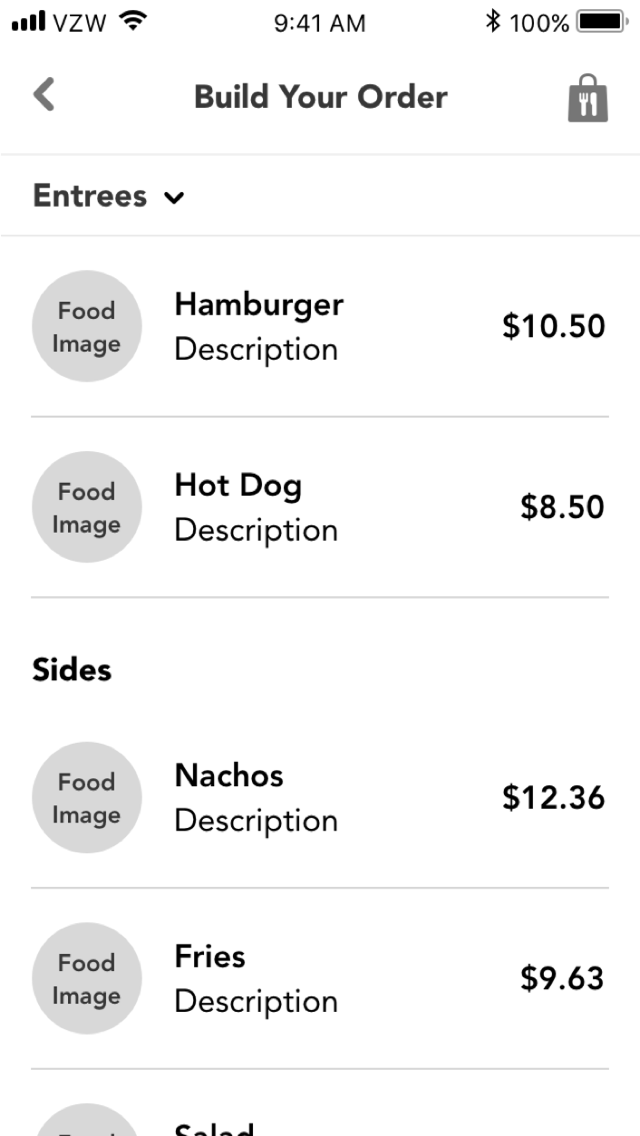
Hub & Spoke
Going in a completely different direction, the Hub & Spoke concept was focused on having a "hub" page with all the categories listed ("spokes"). The user would tap into one of those categories and be presented with all the related Menu items on a separate page.
Putting it to the test
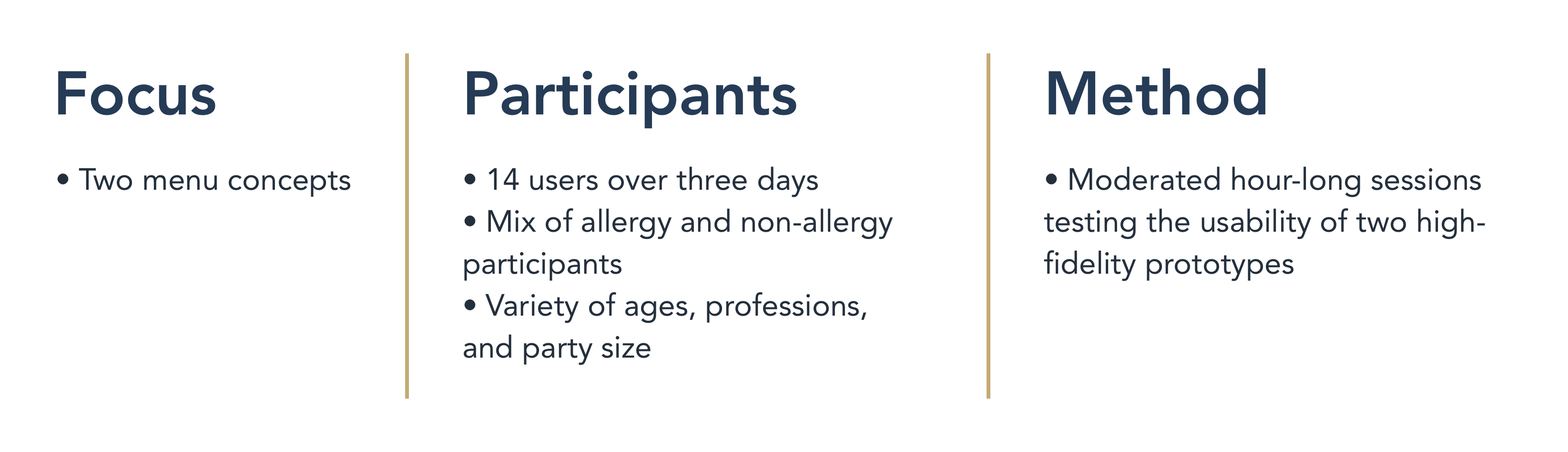
Taking the findings and feedback from leadership and product, the next steps for the team was to put these concepts into the hands of real users. I narrowed the concepts down to two (Dropdown was removed due to it's similarity with Carousel) and created prototypes which I then loaded onto iOS devices for testing.
The goal of user testing was to determine which of those two concepts created the best mobile food ordering experience for our users.
Carousel Prototype
Hub & Spoke Prototype
"I'm going to Disney World!"
With the prototypes in hand, my team and I flew out to Walt Disney World to commence our user testing.
And the winner is...
Of the 14 users that we tested with, all 14 of them preferred the Carousel concept. All 14 users said that the reason they preferred the Carousel was because it encouraged immediate interaction with food categories and made it easy to quickly browse through the Menu.
The results of the testing surprised everyone, as no one was expecting that all our testers would prefer the same interaction pattern. When I compared notes with my team and our reseach partners, one of the captured quotes from a tester perfectly encapsulated what I wanted to accomplish with the redesign.
"At an amusement park, your kids are driving you nuts, you’re tired, you’re hungry… There’s already a lot of things factoring into what you’re doing, so the less layers of complications the better… This is quick eating."
User Tester #9
Final deliverables
With the clear signal from user testing, I proceeded with polishing the Carousel concept and preparing design files for handoff to our development team. The Menu redesign officially launched at both parks in February 2019.

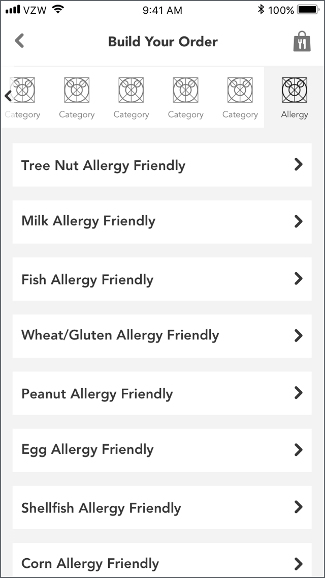
Active and Inactive category icons
Thanks for dropping by. 
Thanks for dropping by.